
```{r setup}
#| warning: false
#| message: false

library(tidyverse)
library(ggtext)
library(gapminder)

south_america <-
  c("Argentina", "Bolivia", "Brazil", "Chile",
    "Colombia", "Ecuador", "Paraguay", "Peru",
    "Uruguay", "Venezuela")

south_america_pop <-
  gapminder::gapminder %>%
  filter(country %in% south_america) %>%
  filter(year == min(year) | year == max(year)) %>%
  select(country, year, pop)
```Compairing values are very trick in dataviz.
Getting life expectancy from South America contries.
south_america_pop %>%
  mutate(year = factor(as.character(year)),
         country = fct_reorder(country, pop)) %>%
  ggplot(aes(x = country, y = pop, fill = year)) +
  geom_col(position = position_dodge2())  +
  scale_fill_manual(
    name = NULL,
    values = c(`1952` = "#D55E00", `2007` = "#009E73"),
    labels = c(`1952` = "<i style='color:#D55E00'>1952</i>",
               `2007` = "<i style='color:#009E73'>2007</i>")
  ) +
  labs(title = "Evolução Populacional de
                <span style='color:#D55E00;'><i>1952</i></span> a
                <span style='color:#009E73;'><i>2007</i></span>",
       subtitle = "América do Sul",
       x = NULL,
       y = NULL,
       fill = NULL) +
  theme_minimal() +
  theme(
    #legend.position = "none",
    plot.title = element_markdown(lineheight = 1.1),
    legend.text = element_markdown(size = 11),
    axis.text.x = element_blank(),
    panel.grid.major.x = element_blank(),
    panel.grid.major.y = element_blank()
  ) +
  coord_flip()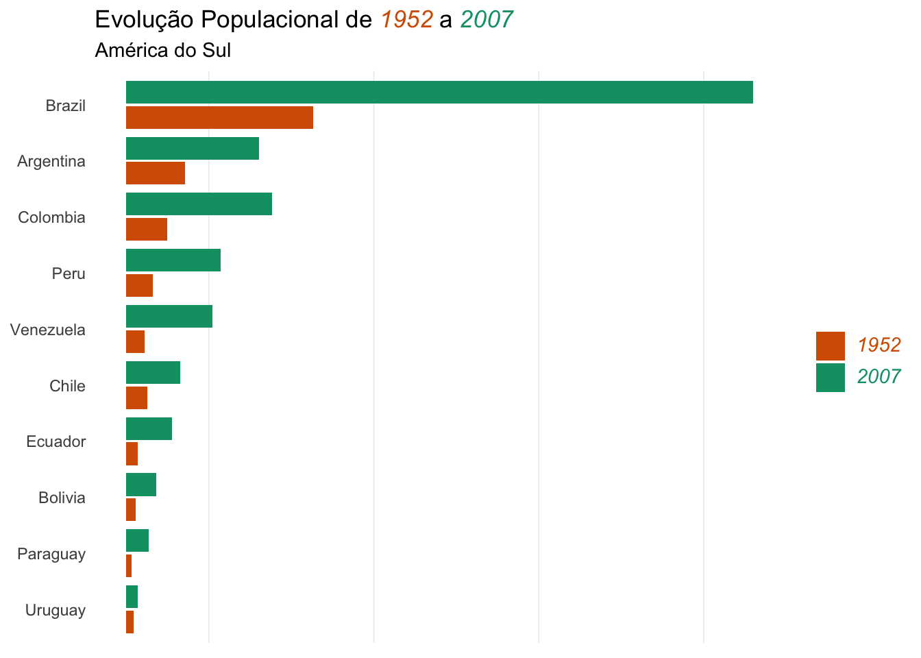
An alternative for the dodged bar plot is the dumbbell plot.
Let’s build one…
# adjust data for segment plot
segment_line <-
  south_america_pop %>%
    pivot_wider(names_from = year, values_from = pop, names_prefix = 'year_') %>%
    mutate(
      change = year_2007 - year_1952,
      country = fct_reorder(country, change)
    )
# adjust data for points plot
south_america_pop <-
  south_america_pop %>%
  mutate(year = factor(year))

dumbbell_plot <-
  ggplot() +
  geom_segment(
    data = segment_line,
    aes(y = country, yend = country, x = year_1952, xend = year_2007),
      col = 'grey60',
      size = 1.25
    ) +
  geom_point(
    data = south_america_pop,
    aes(x = pop, y = country, colour = year), size = 4
    ) +
  scale_color_manual(
    name = NULL,
    values = c(`1952` = "#D55E00", `2007` = "#009E73"),
    labels = c(`1952` = "<i style='color:#D55E00'>1952</i>",
               `2007` = "<i style='color:#009E73'>2007</i>")
  ) +
  labs(title = "Evolução Populacional de
                <span style='color:#D55E00;'><i>1952</i></span> a
                <span style='color:#009E73;'><i>2007</i></span>",
       subtitle = "América do Sul",
       x = NULL,
       y = NULL,
       fill = NULL) +
  theme_minimal() +
  theme(
    legend.position = "none",
    plot.title = element_markdown(lineheight = 1.1),
    legend.text = element_markdown(size = 11),
    axis.text.x = element_blank(),
    panel.grid.major.x = element_blank(),
    panel.grid.major.y = element_blank()
  )
Warning: Using `size` aesthetic for lines was deprecated in ggplot2 3.4.0.
ℹ Please use `linewidth` instead.dumbbell_plot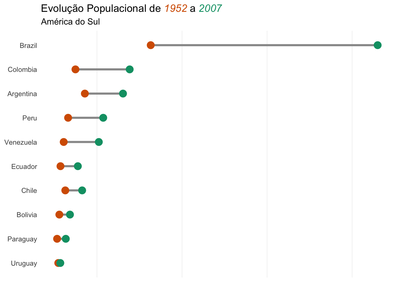
ggsave("dumbbell.png")Saving 7 x 5 in imageCitation
BibTeX citation:
@misc{abreu2022,
  author = {Abreu, Marcos},
  title = {R tip: dumbbell plot},
  date = {2022-11-08},
  url = {https://abreums.github.io/posts/2022-11-08-r-tip-dumbbell-plot/},
  langid = {pt-br}
}
For attribution, please cite this work as:
Abreu, Marcos. 2022. “R tip: dumbbell plot.” November 8,
2022. https://abreums.github.io/posts/2022-11-08-r-tip-dumbbell-plot/.