Construindo um geom_segment com ggimage

Este post mostra como construir um geom_segment com um ggimage. Também tem dica de como usar fontes e formatar o tema do gráfico
Rstats
Author
Published

January 25, 2023

Estou estudando este código para aprender a utilizar ggimage. Todo o crédito é para a autora.

library(tidyverse)
── Attaching core tidyverse packages ──────────────────────── tidyverse 2.0.0 ──
✔ dplyr     1.1.4     ✔ readr     2.1.5
✔ forcats   1.0.0     ✔ stringr   1.5.1
✔ ggplot2   3.4.4     ✔ tibble    3.2.1
✔ lubridate 1.9.3     ✔ tidyr     1.3.0
✔ purrr     1.0.2     
── Conflicts ────────────────────────────────────────── tidyverse_conflicts() ──
✖ dplyr::filter() masks stats::filter()
✖ dplyr::lag()    masks stats::lag()
ℹ Use the conflicted package (<http://conflicted.r-lib.org/>) to force all conflicts to become errors
library(showtext)
Loading required package: sysfonts
Loading required package: showtextdb
library(camcorder)
library(magick)
Linking to ImageMagick 6.9.12.93
Enabled features: cairo, fontconfig, freetype, heic, lcms, pango, raw, rsvg, webp
Disabled features: fftw, ghostscript, x11
library(ggimage)
library(palmerpenguins)

Roboto é uma fonte muito mais agradável que o padrão do ggplot2. Também gostei do Cinzel Decorative para títulos.

#load fonts
font_add_google("Cinzel Decorative", "cinzel")
font_add_google("Roboto", "roboto")
showtext_auto()

Sempre podemos usar o dataset de Palmer Pinguins, é uma base muito versátil.

# plot data
plot_data <- 
  penguins |> 
  count(species) |> 
  mutate(species = fct_reorder(species, n))

Copiei esta função do link acima, inclusive a referência para a fonte original.

# Process images
# custom function to apply border to circle image with magick
# Code: https://github.com/tashapiro/tanya-data-viz/blob/main/spotify-artists/scripts/generate-image-labels.R
border <- function(im) {
  ii <- magick::image_info(im)
  ii_min <- min(ii$width, ii$height)
  
  img <- magick::image_blank(width = ii_min, height = ii_min, color = "none")
  drawing <- image_draw(img)
  symbols(ii_min/2, ii_min/2, circles = ii_min/2, bg = 'white', inches = FALSE, add = TRUE)
  dev.off()
  
  x = image_composite(image_scale(drawing, "x430"), image_scale(im, "x400"), offset = "+15+15")
  
  x
}

E finalmente o gráfico.

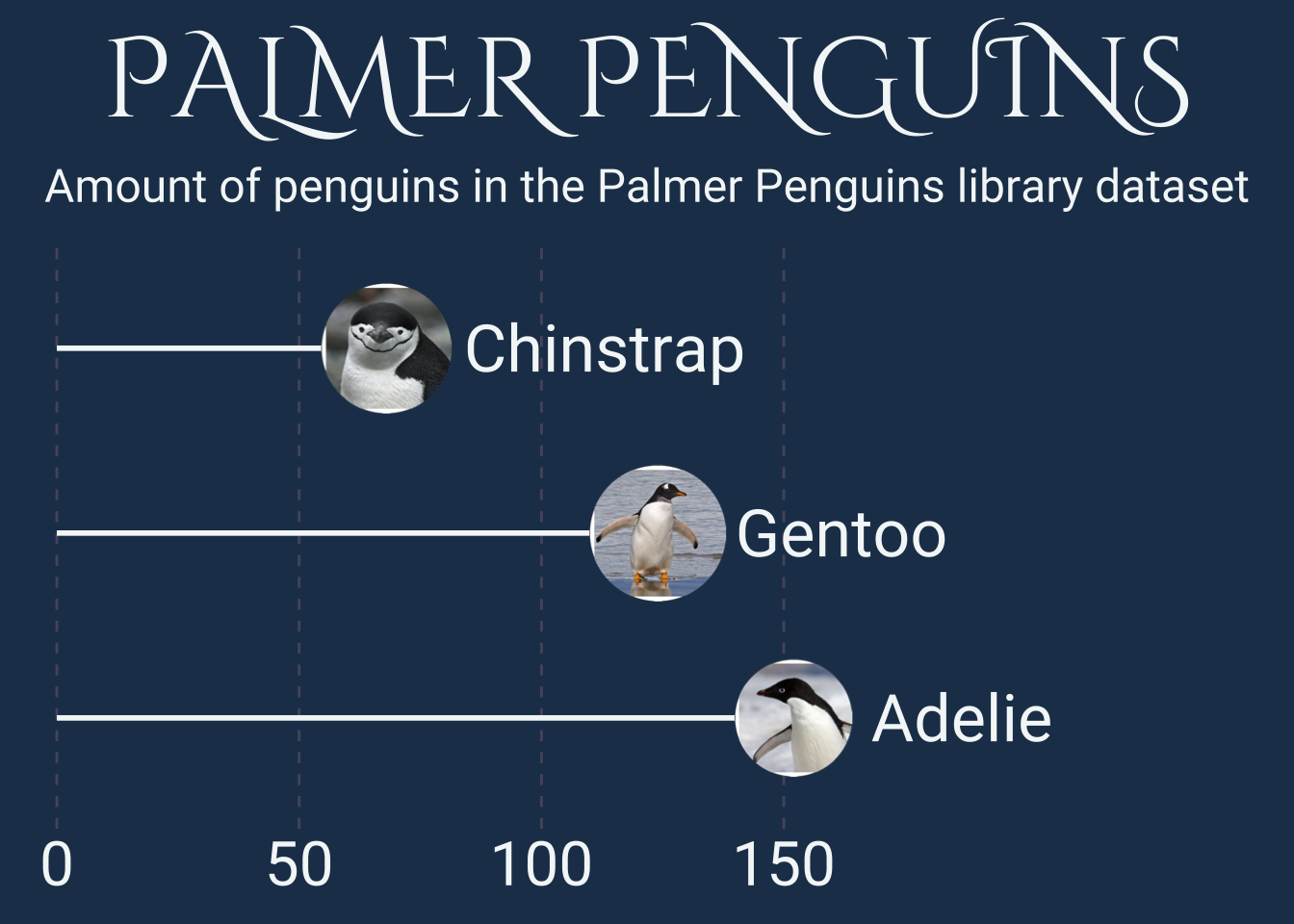
st <- "Amount of penguins in the Palmer Penguins library dataset"

ggplot(data = plot_data) +
  geom_segment(mapping = aes(x = 0, 
                             xend = n,
                             y = species,
                             yend= species),
               colour = "#f4f7f7",
               size = 1) +
  geom_image(mapping = aes(x = n,
                           y = species,
                           #image = paste0("posts/2023-01-25-ggimage/images/", species, ".png")),
                           image = paste0("images/", species, ".png")),
             asp = 2,
             size = 0.12,
             image_fun = border) +
  geom_text(mapping = aes(x = n + 16, 
                          y = species,
                          label = species),
            size = 9,
            hjust = 0,
            family = "roboto",
            colour = "#f4f7f7") +
    scale_y_discrete(limits = rev) +
  scale_x_continuous(breaks = c(0, 50, 100, 150),
                     limits = c(-5, 250),
                     expand = c(0, 0)) +
   labs(title = "PALMER PENGUINS",
       subtitle = str_wrap(st, 70),
       x = NULL,
       y = NULL) +
  theme(axis.text = element_text(family = "roboto",
                                 size = 24,
                                 lineheight = 0.4,
                                 colour = "#f4f7f7"),
        axis.text.y = element_blank(),
        axis.title = element_text(family = "roboto",
                                  size = 24,
                                  lineheight = 0.4,
                                  margin = margin(t = 10),
                                  colour = "#f4f7f7"),
        axis.ticks = element_blank(),
        plot.subtitle = element_text(family = "roboto",
                                     size = 18,
                                     hjust = 0.5,
                                     lineheight = 0.4,
                                     margin = margin(b = 10),
                                     colour = "#f4f7f7"),
        plot.title = element_text(family = "cinzel",
                                  size = 44,
                                  hjust = 0.5,
                                  margin = margin(b = 10),
                                  colour = "#f4f7f7"),
        plot.margin = margin(10, 10, 10, 10),
        panel.grid.minor = element_blank(),
        panel.grid.major.y = element_blank(),
        plot.title.position = "plot",
        panel.grid.major.x = element_line(linetype = "dashed",
                                          colour = alpha("#bb8899", 0.3)),
        plot.background = element_rect(fill = "#203d58", colour = "#203d58"),
        panel.background = element_rect(fill = "#203d58", colour = "#203d58"))
Warning: Using `size` aesthetic for lines was deprecated in ggplot2 3.4.0.
ℹ Please use `linewidth` instead.

Citation

BibTeX citation:
@misc{abreu2023,
  author = {Abreu, Marcos},
  title = {Construindo um geom\_segment com ggimage},
  date = {2023-01-25},
  url = {https://abreums.github.io/posts/2023-01-25-ggimage/},
  langid = {pt-br}
}
For attribution, please cite this work as:
Abreu, Marcos. 2023. “Construindo um geom_segment com ggimage.” January 25, 2023. https://abreums.github.io/posts/2023-01-25-ggimage/.